When it comes to branding, color is more than just a design choice—it’s a cornerstone of identity. From the deep crimson on a university crest to the signature blue of a city government logo, color tells a story before a single word is read. But ensuring that color stays consistent across every banner, brochure, or business card is not as simple as it sounds. That’s where the Pantone Matching System (PMS colors) comes in.
In this guide, we’ll explore what PMS colors are, how they’re organized, and why they matter for professional printing and large-scale branding.
What Are PMS Colors?
The Pantone Matching System (PMS) is a standardized color reproduction system created by Pantone. It was designed to solve one major problem: making sure colors look the same everywhere, no matter who prints them or where they’re produced.
Unlike digital colors that rely on RGB (red, green, blue) or CMYK (cyan, magenta, yellow, black), PMS colors are pre-mixed, exact shades. Think of it like ordering a specific paint color by name rather than trying to mix it yourself every time.
For example, if your brand uses Pantone 186 C (a bright, bold red), it will look the same on a business card, a brochure, or a 20-foot trade show banner. That consistency is what sets PMS colors apart.
Source: Pantone’s explanation of color systems
How PMS Colors Are Organized
Pantone has developed thousands of unique colors, each with its own number and formula. Here’s how they are typically organized:
- Solid Colors: The foundation of PMS, these are pre-mixed inks that deliver unmatched consistency.
- Coated (C) vs. Uncoated (U): You’ll often see “C” or “U” next to a PMS number. This refers to whether the color is printed on coated (glossy) or uncoated (matte) paper. The ink is the same, but the finish changes how it looks.
- Extended Libraries: Beyond traditional inks, Pantone has added metallics, pastels, and neons for specialized branding needs.
This organization ensures brands can choose colors confidently, knowing exactly how they will appear across different materials and finishes.
PMS Colors vs. CMYK: What’s the Difference?
One of the most common questions marketing directors ask is: Why not just use CMYK?
Here’s the breakdown:
- CMYK (Cyan, Magenta, Yellow, Black): Used in most digital and offset printing. CMYK mixes colors during printing, which can sometimes lead to slight shifts in shade.
- PMS Colors: Pre-mixed inks that are exact, leaving no room for variation.
For everyday projects, CMYK works well. But when brand integrity is at stake—especially across large-scale campaigns—PMS colors are the gold standard.
Why PMS Colors Matter for Branding
Color isn’t just decoration—it’s recognition. Studies show that consistent branding can increase revenue by up to 23%. A color that looks “close enough” won’t cut it when customers expect consistency.
Here’s why PMS colors are crucial:
- Consistency Across Locations Franchise operations, universities, and government organizations often operate across multiple cities or campuses. PMS colors guarantee the logo blue in California looks identical to the one in New York.
- Professionalism in Print Campaigns From business cards to large trade show displays, every piece of marketing collateral reflects your brand. PMS colors ensure a seamless, professional look across every format.
- Long-Term Brand Integrity Color standards protect your brand identity over time, even as new campaigns, vendors, and printers come into play.
Real-World Applications of PMS Colors
Let’s look at where PMS colors make the biggest impact:
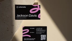
- Business Cards: A small but powerful brand touchpoint. Using PMS colors ensures your card makes the same impression at every networking event.
- Print Ads: Whether in local publications or national magazines, PMS colors guarantee your brand stands out consistently.
- Trade Show Displays: Large-scale signage demands precision. PMS prevents the nightmare of mismatched logos under bright event lights.
- Branded Merchandise: From pens and tote bags to uniforms, PMS keeps your brand identity intact across promotional products.
When clients trust The Printery with these materials, they know color accuracy isn’t just a detail—it’s a promise.
Visit The Printery to explore our full range of professional printing services.
How The Printery Uses PMS Colors
At The Printery, we know that for marketing teams, accuracy matters as much as creativity. That’s why we use PMS colors to help clients:
- Translate digital designs into print with precision
- Maintain consistency across multi-location campaigns
- Save time and money by reducing costly color corrections
PMS ensures your brand looks exactly as you intend, whether for a small run of custom stationery or a large trade show display.
Final Thoughts
For marketing directors, universities, franchise owners, and government agencies, brand consistency isn’t optional—it’s essential. PMS colors provide the foundation to maintain that consistency across every campaign, every format, and every location.
When color tells your brand’s story, make sure it’s the right one—every time.